Background 📋
Before we dive into the product, we should probably understand the goals of Advisar, a child company of it’s parent, Masonite - a global builder of doors.
Masonite is in the business of manufacturing and selling high-volumes of doors to distributors, such as The Home Depot and Lowe’s.
But in 2017, Masonite wanted to begin testing products downchannel to contractors and homeowners - so they formed a small internal incubator that would serve as “beta test” with a single goal in mind:
Help contractors connect with homeowners, enable their sales teams, manage their orders, and gain insights into their business
After many small product pivots, Advisar began seeing real traction with medium-to-large size home remodelers. Using qualitative research, market data, and iterative design methods, an application was created to help contractors configure, quote, order and track their purchases.
I joined the Advisar team in early 2019 as the sole designer on a development team made up of 8 engineers, a development manager, 2 QA engineers, and a product owner.
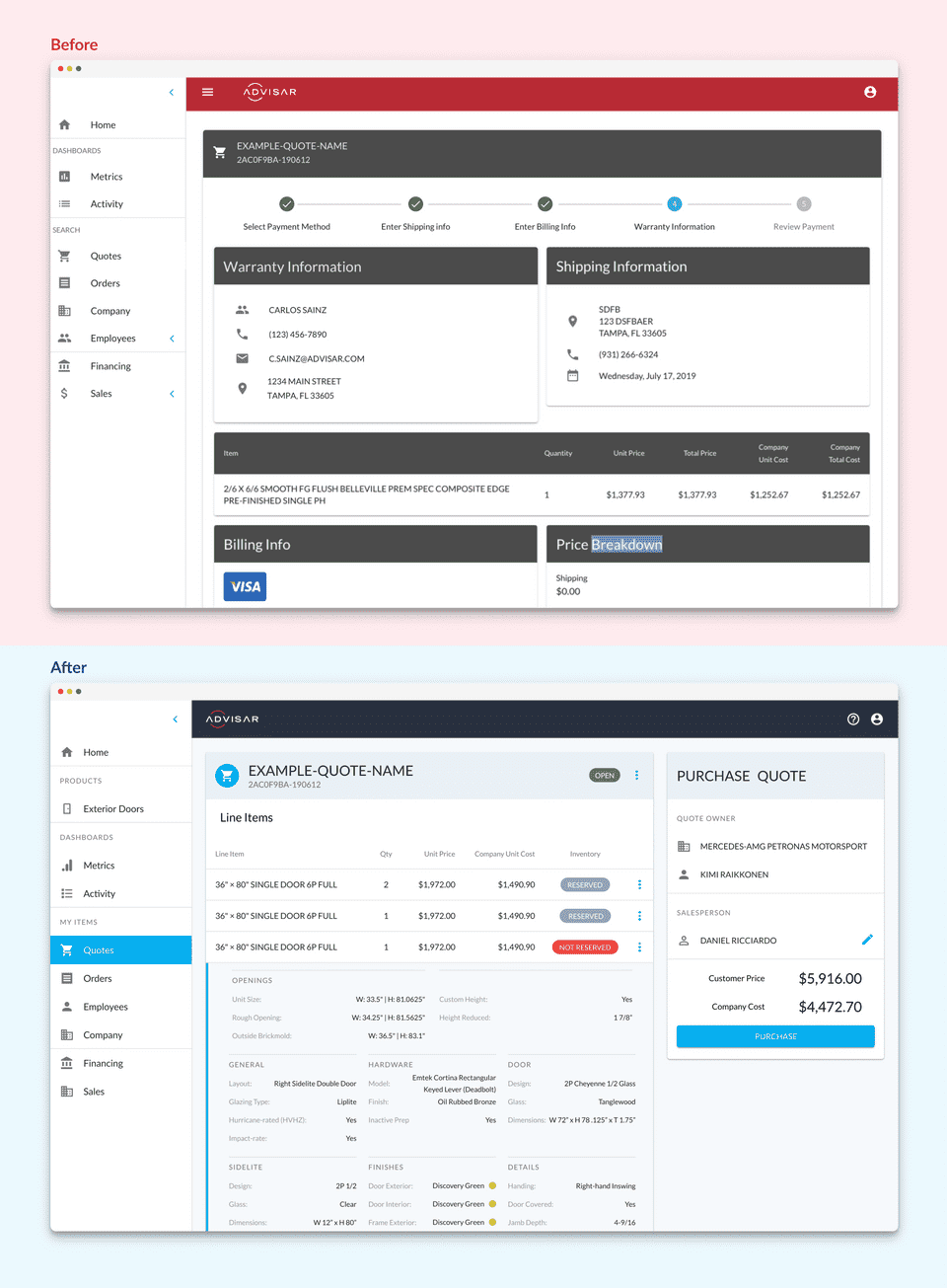
While our team was also working through other projects, including a redesign of our door configurator, we saw a need to rectify a few design issues in the Advisar Core Application as well - consolidating the UI for both under a single design system.
We saw incredible value using a research-backed design process from our experience in the configurator, so we began doing the same, in tandem, with this project (Take a look at the design process we used!).
As the only designer on the team, and juggling many projects running in Agile/SCRUM, staying organized using a design process was crucial for me - managing research, user interviews, prototyping, and wireframing could all be compartmentalized into phases.
Discovery and Research 🕵️♀️
We had alot to do and we needed to begin prioritizing which features to add/edit in the core application.
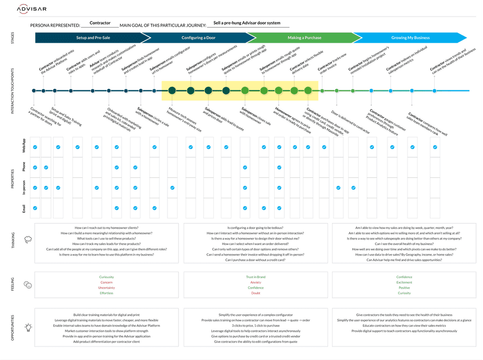
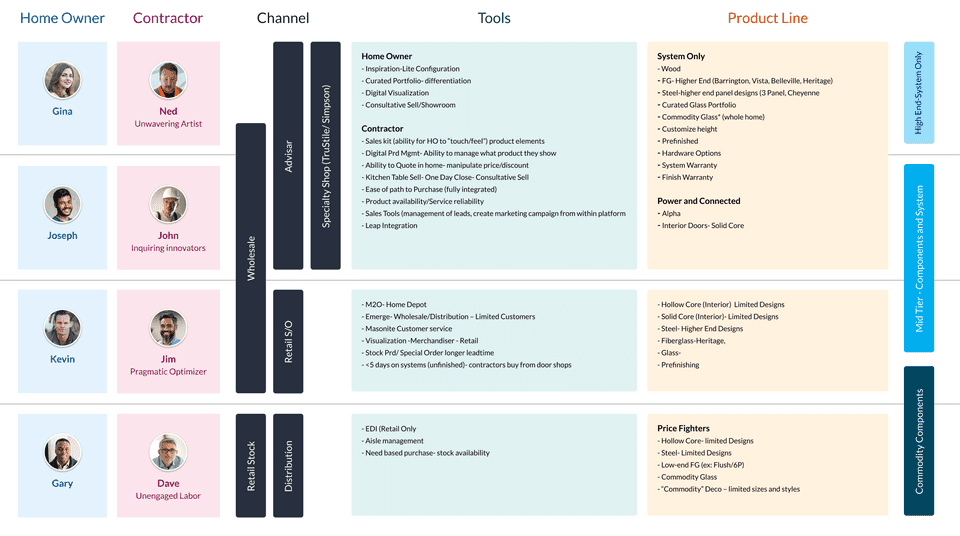
Before any of that, we had to conduct some qualititave research using user interviews from our contractor clients. Using this data, we were able to see exactly what their current process looks like, their pain points with the current interface, and how we could prioritize a rollout of new features that would help allay their frustrations.
Pain Points
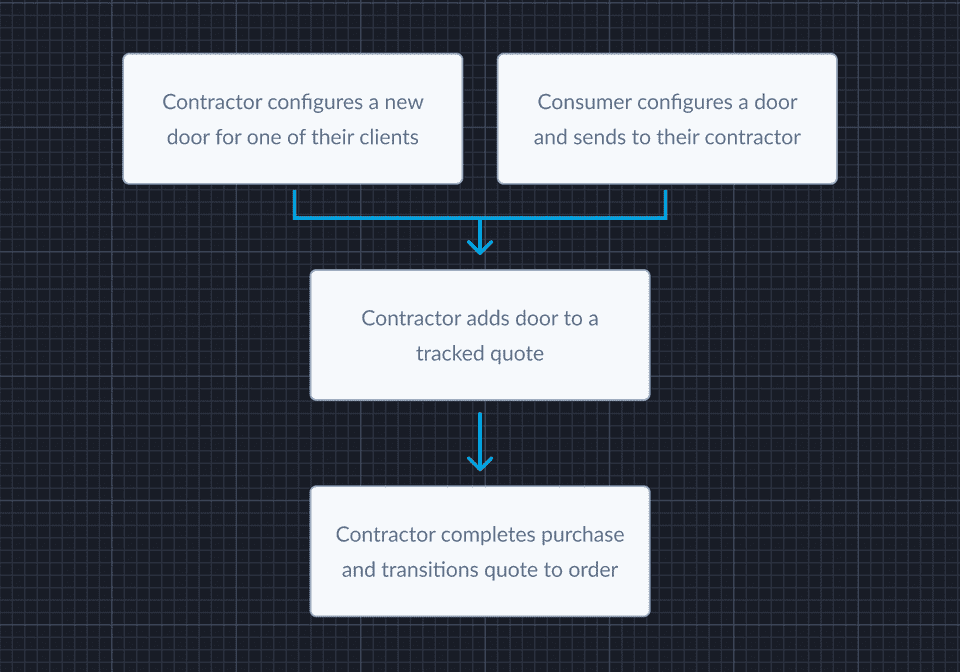
We began mapping out what we wanted the user flow, from lead to order, to look like:
Use Cases 👩🏫
Our research and qualitative interviews identified the use cases for contractors:
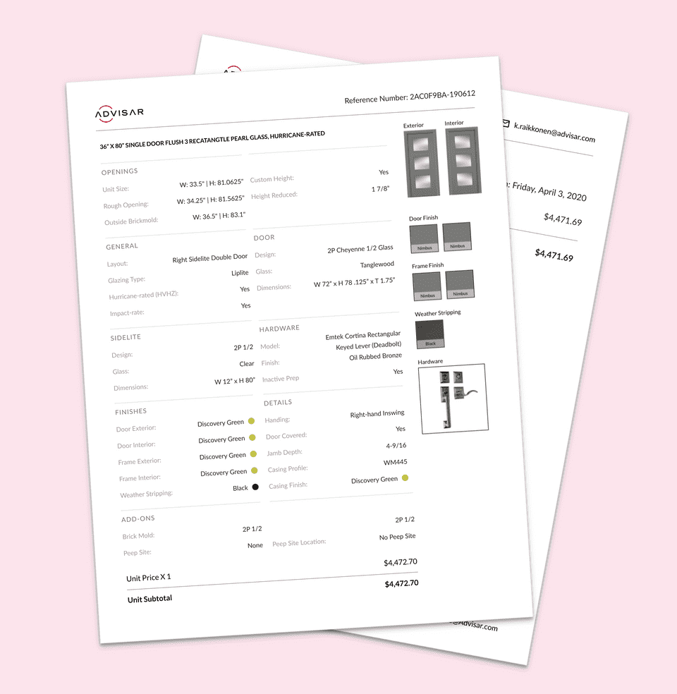
I am a Contractor and I want to be able to send quotes by email or hand over a printed invoice.
I am a Contractor and I want to track how well my sales teams are doing.
I am a Contractor and I want to be able to see insights from customer preferences.
Refactoring the UI 🧼
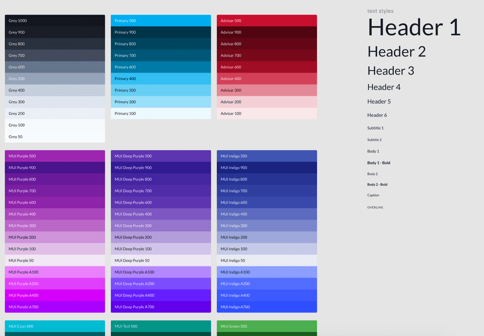
We were using Material UI as a design language throughout the Advisar platform - helping us design/develop quickly, as well as having many standard patterns given to us out-of-the-box. However, our implementation of it left much to be desired when it came to consistency, usability, and accessibility.
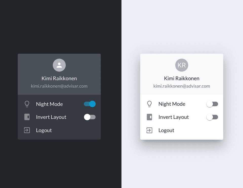
The first step was to conduct an audit of our UI - so I began taking stock of what items were hindering usability and context. We came up with a new color theme, typography, and spacing units. We also looked at how we were utilizing layout and how it was impeding context and affordances.
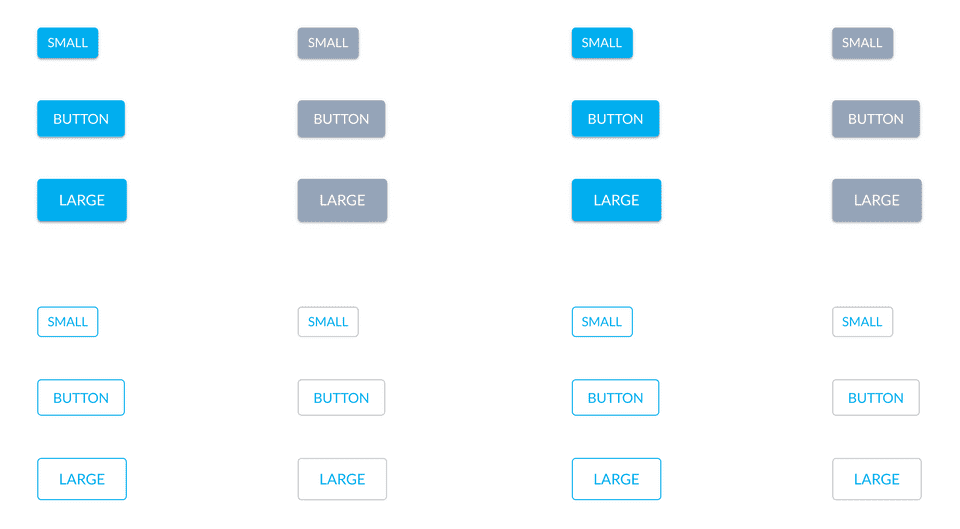
Rather than make changes to our UI feature-by-feature, we decided to refactor our base styles and components from the start. Doing so let us have our "mise en place 👩🍳" setup for the features in our product roadmap.
Feature Discovery 🤩
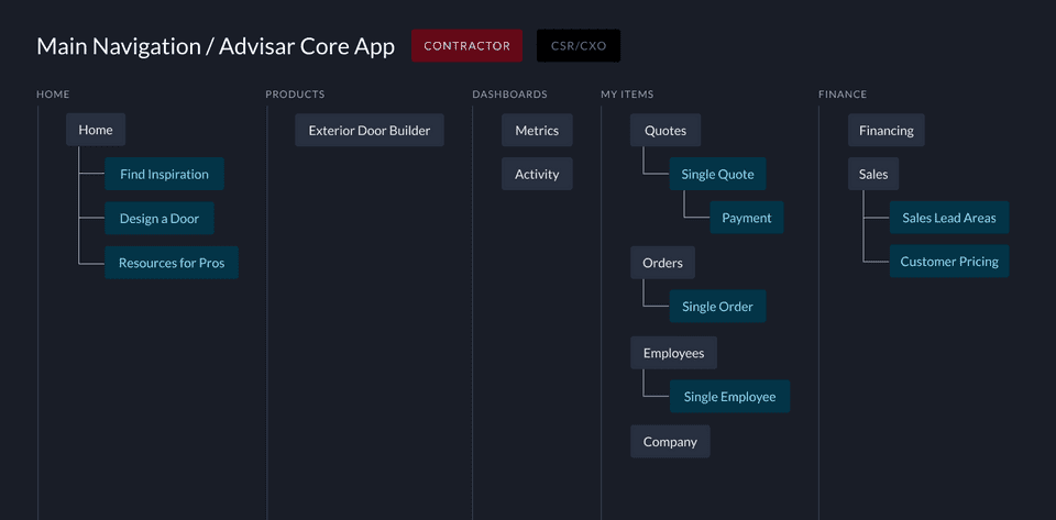
Now that we had our UI and base components built, we needed to begin mapping out the refactored app architecture per a userflow that made more sense. On top of that, we needed to start ideating upon our feature redesigns while considering the feedback we've received from our qualitative research.
Features we need to address:
Quotes/Orders
Payment Flow
Dashboard
Company/User profile
Features we need add and test:
Leads: give contractors a way to asynchronously interact with their homeowner clients
Sales Insights: enable contractors to see the health of their business
Product Analytics: let contractors view customer preferences
Managing Quotes for clients 🧾
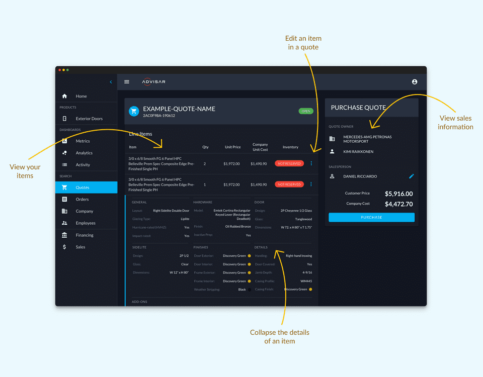
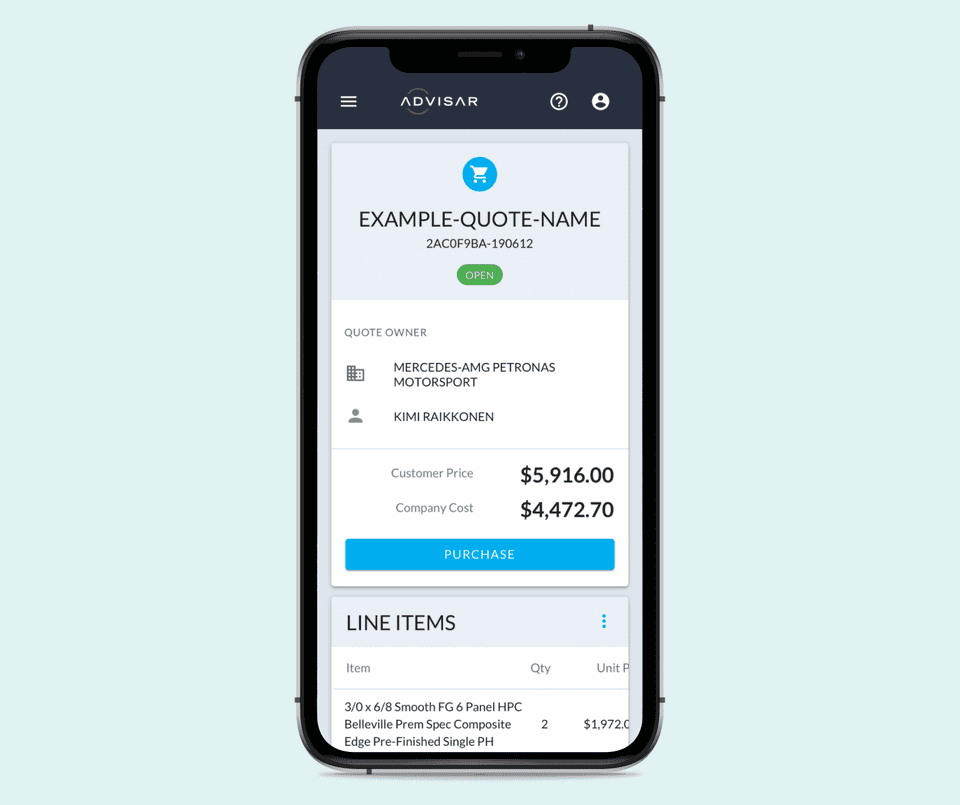
After a contractor configures an item, they're able to add to a quote for a client. While in the quote, the contractor is now able to easily:
- Assign a team member as the salesperson
- Return to the configurator to modify an item
- View the door details in a collapsable table
- Reserve inventory before purchasing
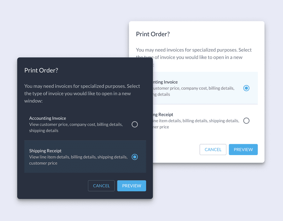
- Print different types of invoices for internal teams or external clients
Payment Flow 💸
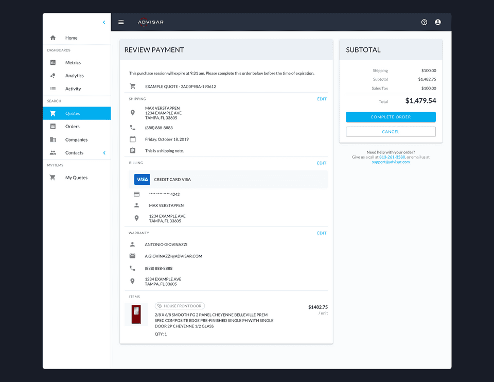
Our payment flow was broken and tedious - we needed to address issues that were prventing contractors from moving a quote to purchase:
- Offer multiple payment options
- Refactor for better context
- Fluid for mobile layouts
- Add temporary state in case user leaves
Contractors are now able to step forward and back, add warranty, and choose to pay by credit card or third-party credit vendors.
Dashboard 📊
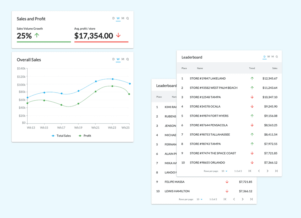
A dashboard is a high-level preview of crucial information important for the user at the moment they are looking at it. But we want this space to be utilized for the analytical/operational tasks for users rather than just for outbound links.
Company/User Profile 👩💻
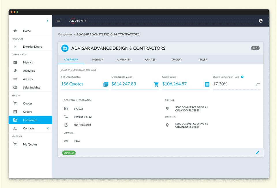
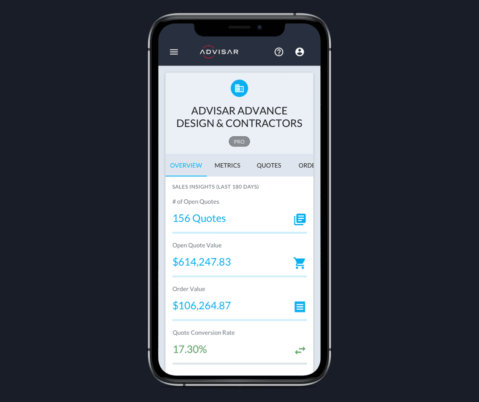
Our UI for viewing a single company or user wasn't following our UI patterns - cards on cards, illogical context, etc. We wanted to make this view easier to scan and make usefult for users who wanted to utilize this space while on the go and on their mobile devices.
Sales insights 📈
How can we give contractors a way to see the health of their business and index on where there is success, and where there are issues with their sales process?
We began ideating on which items were important to sales teams, first with our internal sales team members:
- Gamifaction of team members
- Trend data against timescales
- Indexing on revenue
We created a new view for sales team members where they were able to view their clients' quotes, orders, and conversions while viewing the trend over time. They're also able to index on the company to view how much money they're quoting against how much they're purchasing.
We also introduced a leaderboard so sales managers can track how well their sales teams are doing amongst each other.
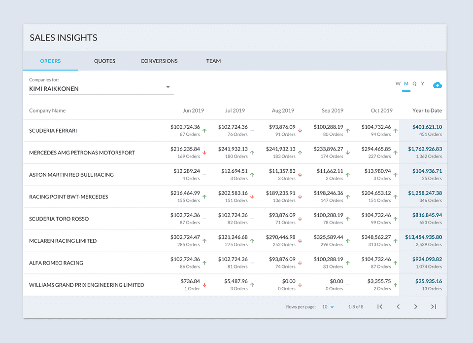
When thinking about gamifying the insight data, we had to reason out use cases from our users' point of view:
Admins, Owner, CEO: want to view overall performance and health of the entire business
Team Leader, Sales Leader: want to see the performance of the local business and each team member
Salesperson: want to see upcoming tasks assigned to them + how they rank amongst their team.
Product Analytics 💡
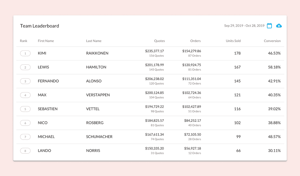
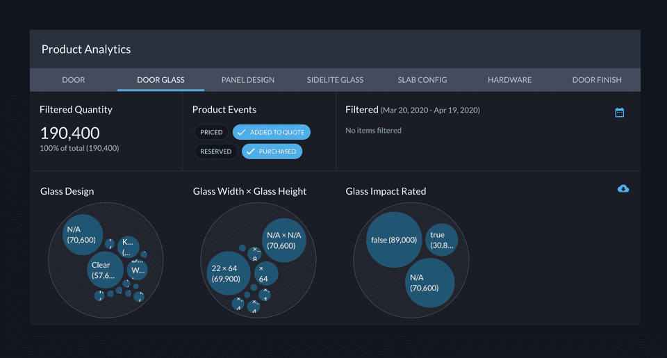
How can users gauge consumer preferences using accumulated order data?
We wanted to level the playing field and give our contractors a way to see which options are selling vs. which options are just being quoted. We began testing a feature with our internal teams, with the reasoning of shaping our internal manufacturing shipments.
After testing and slight polishes to how users can index upon options and timescales, we began introducing an Analytics feature to empower admins at contracting companies.
Contractor-Homeowner interaction 🏠
How can contractors interact with homeowners?
One of our goals was to help bridge the gap between contractors and homeowners. To do so, we needed to add marketing outreach and sales tools to our platform. We needed to find a way to empower the contractor to interact asynchronously with their clients without having to meddle in the middle.
We began by viewing contractors' sales process and analyzing our interview data. We mapped out a high-level flow of our proposed experience and subsequntly began mocking out what features we needed to accomodate for the contractor and homeowner.
To help bridge the gap we wanted the Advisar platform to:
- Streamline door building/buying process
- Build more meaningful relationships with our consumers
- Bridge the gap between contractors and consumers
- Enable sales teams to interact with their consumers
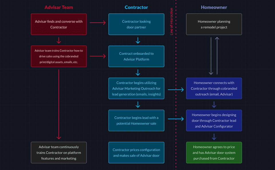
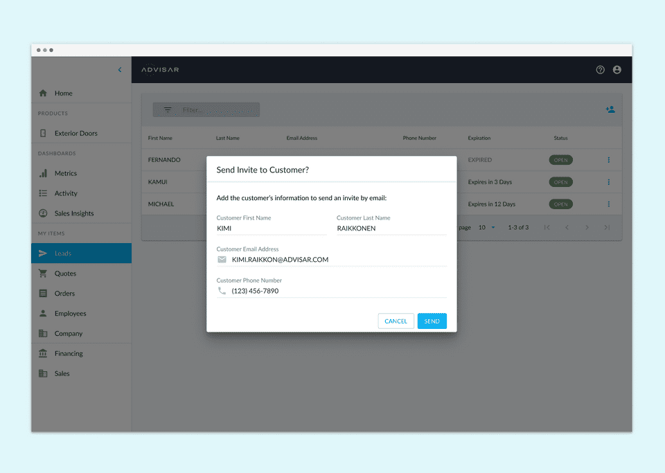
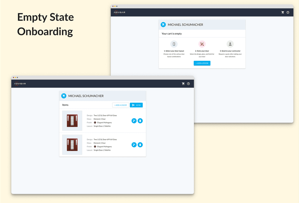
Once a contractor sends an invite to a homeowner, a lead is created and the homeowner has a timed url that allows them to design a door through our door configurator.
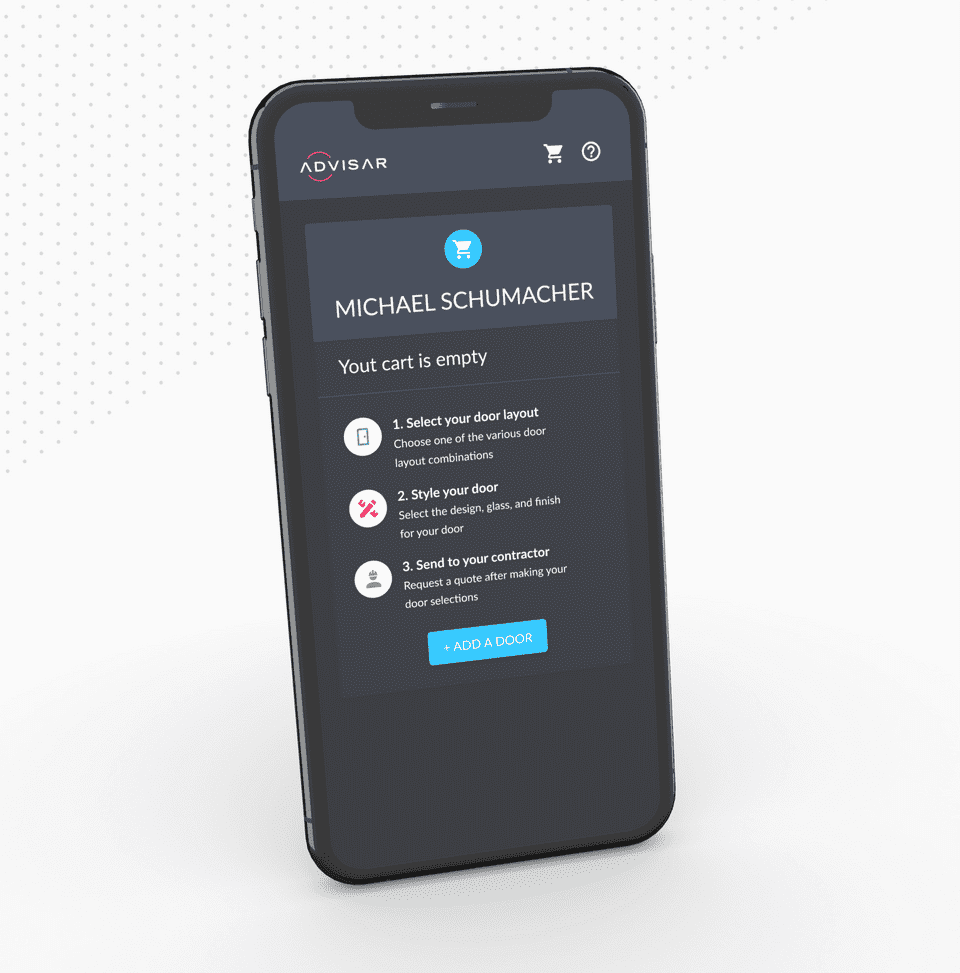
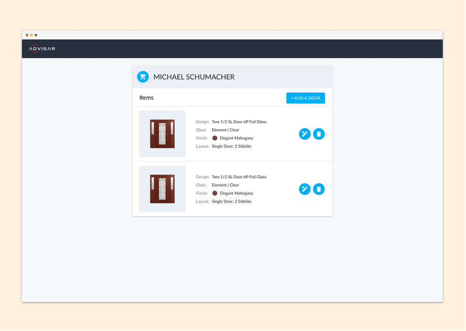
Homeowners can add/edit doors in their cart, which a contractor can view in realtime through the lead that was created.
Sales Insights ✨
How can contractors find sales prospects based on data in their sales regions?
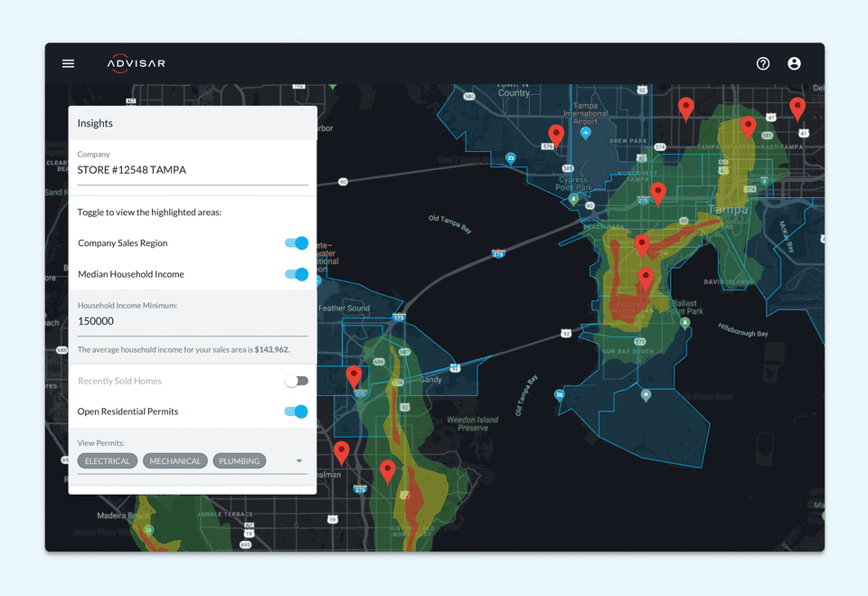
We wanted to empower contractors to find sales more easily. By using public property data and overlaying their chosen sales zip codes, we help filter where sales may occur:
- Recently sold homes
- Open and registered contruction permits
- Median zip code income
By using multivariate data, contractors can better target sales prospects - in turn, increasing conversion, reducing inefficiencies, and growing their business.
Next Steps and Takeaways 💡
First off, if you've made it this far, thank you 🙏 - this project is a labor of love for our amazing team and I'm happy I can share a bit of our process!
Be curious and proactive: we took a user-first approach with the Advisar platform by reaching out to people to understand more about their processes. Whether it was stakeholders, contractors, customer support - each have provided data that helped us build a scalable, profitable platform.
Intention and push back: As a team, we learned to make products with reasoning whether that is UX or business related. I also learned that it's okay to push back if I need more time. It’s okay to push ideas if you are passionate about driving a better experience.
Bringing value to the larger business: One of the things we all had to keep in mind was how the platform for this side of the business would integrate and scale with the larger parent, Masonite. Figuring out those overlaps could prove beneficial - where we could consolidate our digital products instead of having separate products for the same issues in different sides of the larger business.
Measure outcomes not output: It seems as though traditional development teams have a bias for measuring on quantitative output, rather than how successful a product lands with a user group. However, this project has taught us that the speed of the build should be less important than "what we build" and "why we are making it".
From invoicing to consulting: One of the largest pivots we've made is to transition from a simple quoting tool to a platform that can empower a contractor and help them grow their business. We're still trying to figure out what a contractor needs and how they would use these tools, but we think we're on the right track.
Thanks for reading!
If you'd like to see more work, head back to view all work or check out one of my selected projects:
Back to Work